A New School Logo
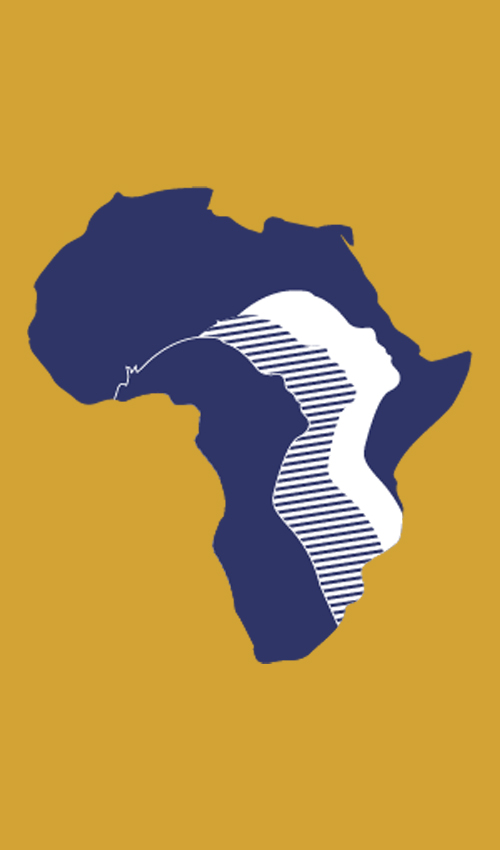
The current BMIS logo has three faces hidden within the African continent, but before this iteration stands archives of logos representing different periods in BMIS’s history. The logo has evolved with the school to represent our more international and diverse focus over the years.

In interviews with alumni Mickey Sabelli and former teachers Claire and Brian Webster we learn how one logo came from a student's designs.
The logo was designed when I was in primary school by secondary students who partook in an art competition. It was a long process which involved several stages and finally three designs were selected for the final round with the aim of integrating all three into the school logo. It was a very important for BMIS because it was a move away from the Mitre logo which had its symbolism in Christianity to a logo that represented the diversity of races religions and nationalities within the school. The three faces were included to emphasize this and to “look up and look forward” towards an even better future - a creative thinking, international and all-inclusive school in the warm heart of Africa. One of the students who contributed to this final logo is still based here in Lilongwe
Mickey vaguely remembers the old logo being a blue shield with blue and white wavy lines denoting the lake and some red as well perhaps a Bishop’s mitre.
“Hank, the art teacher at the time, led the design of the logo which I think you still use a variation of. We were there at the time when it was first [designed]. We had designs up in the staffroom. We had to look at them and choose which design we wanted and I remember it being a very impressive design.”
Brian and Claire Webster
2024
A New School Logo
The current BMIS logo has three faces hidden within the African continent, but before this iteration stands archives of logos representing different periods in BMIS’s history. The logo has evolved with the school to represent our more international and diverse focus over the years.
In interviews with alumni Mickey Sabelli and former teachers Claire and Brian Webster we learn how one logo came from a student's designs. The logo was designed when I was in primary school by secondary students who partook in an art competition. It was a long process which involved several stages and finally three designs were selected for the final round with the aim of integrating all three into the school logo. It was a very important for BMIS because it was a move away from the Mitre logo which had its symbolism in Christianity to a logo that represented the diversity of races religions and nationalities within the school. The three faces were included to emphasize this and to “look up and look forward” towards an even better future - a creative thinking, international and all-inclusive school in the warm heart of Africa. One of the students who contributed to this final logo is still based here in Lilongwe
Mickey vaguely remembers the old logo being a blue shield with blue and white wavy lines denoting the lake and some red as well perhaps a Bishop’s mitre.
“Hank, the art teacher at the time, led the design of the logo which I think you still use a variation of. We were there at the time when it was first [designed]. We had designs up in the staffroom. We had to look at them and choose which design we wanted and I remember it being a very impressive design.”
Brian and Claire Webster
2024
2024